
INTERVIEW WITH CHIKASHI SUZUKI
During the years 2000 to 2010, one of the major shift unfolded in 2004 when the PURPLE editors Elein Fleiss and Olivier Zahm parted to go separate ways. Then in 2008, Martin Margiela retired from his own brand.
That was a distinct demarcation in fashion. From there on, what you might call a “hype” took over the scene. To put it simply, fashion became reliant on celebrity advertisement and that trend has been continuing ever since, even today. Up until when Margiela was having the spotlight, the value was on the clothes itself and anyone could carry a style as long as the clothes was powerful. And back then, Elein’s way of creating content was by using her friends as models so I believe the gap between Olivier became bigger with the new trend.
Was there an epoch-making expression in fashion photography during that borderline of shift?
Juergen Teller, at the time, had pushed the art of snap-photo in fashion onto the next phase. For example, 35mm camera wouldn’t pick up enough details of clothes compared to the medium and large format cameras that were most common for fashion shoot. But Teller used it with daylight sync technique utilizing strobe in outdoor sunlight to brighten the dark details, and even used clip-on light on the face to reduce wrinkles so it requires less retouching.
The role of fashion designer had gradually changed with time as well. Tom Ford accepted the creative director position for GUCCI in 1994, and for YVES SAINT LAURENT RIVE GAUCHE in 2001.
Tom Ford was one of the first person to become a creative director in the fashion world. He was the one to demonstrate the concept of brand renewal for established brands. He first started with reorganizing the brand identity that was all over the place with license undertaking and then, little by little, controlled the total image of the brand. The path he created became the standard for designers in today’s high brand fashion.
We can also call on Hedi Slimane as another designer who had recast the scene of that time in a different way from Tom Ford.
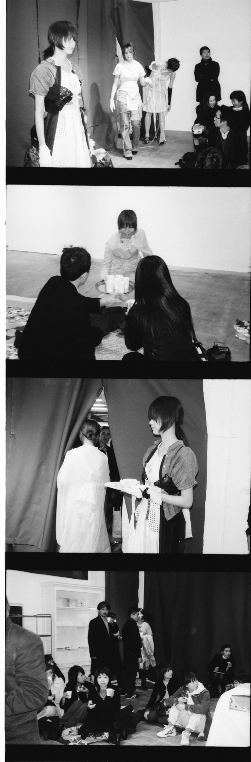
I was actually in back stage of the first show of DIOR HOMME with the SELF SERVICE’s team. And something that I still remember happened when I pointed my camera at Hedi dressing the models. His background was rather dull for photography but as for us, we just needed to shoot the scene regardless of the situation. Then at that moment, he must have noticed me shooting and swiftly moved in front of the red backboard and continued dressing the model. The key color of the collection was red, you see? He was very conscious about the image of how he would be viewed and I realized he was a new breed compared to the other designers. Most designers would be quite nervous right before the show.
In 2008, Phoebe Philo was promoted to be the creative director of CELINE and she was also a different type of designer as well.
Most of the female fashion designers up until then had an image of hard-worker, a type that’s immersed in their work so to say. But Phoebe Philo had adopted maternal leave herself during her time at CELINE, and had moved her office to London instead of keeping it at the Paris headquarters. This is totally my personal opinion but I feel like the French design had been taking over the fashion scene around that time and Phoebe was the one to switch the flow into British mode. For example, the design details of her bags had a similar feel to SMYTHSON, the British leather notebook brand’s design. British people also tend to prefer stiff material for suits and would sew in a stiffener on the inside to prevent any wrinkling. It is quite contrasting to the soft and comfortable suits of Italy. I believe Phoebe began using bonded fabrics for this reason, to express feminine softness within the British aesthetic. For us photographers, to include wrinkles or not on set is a major factor so we can’t help but to look at collections from that perspective (laughing).
That’s an important point how there is a national characteristic in sensibility for fabric.
For example, stiffer uniform-like fabrics are often preferred in Japan. And say for sneakers, Americans would consider soft nubuck-like leather condition to be high quality even for ADIDAS Stan Smith and Superstar but Japanese considers smooth patent-type leather to be luxury.
During the 2000s, magazines were a major factor for instilling mode fashion. How did the trend take off in Japan?
In Japan, accomplishment of two stylists, Tomoki Sukezane and Tsuyoshi Noguchi greatly contributed to how mode brands made inroads. Especially the editorial section they created for BRUTUS and MR. High Fashion magazines played a huge role. For example, for the DIOR HOMME layout, they created some pages showing themselves wearing the brand’s clothes along with the usual pages of foreign models posing, followed by a spread showing 20 to 30 items in still life. In European magazines, it rarely showed stylists’ personal pieces and was even more rare to have still life shots.
In terms of that time, Mr. Chiba of POETRY OF SEX was another figure with a sensibility that lead to today’s fashion.
As for Mr. Chiba, I have so many amazing stories. He’s the kind of guy who waits for Richard Prince to appear at his hotel lobby, hand him 200 dollars and say, “make a t-shirt with me!” (laughing). But then he really releases a t-shirt with Richard’s ‘HIPPIE DRAWINGS’ images. That’s what’s amazing about Chiba. The bigger stars tend to take more interest in others that makes you think “oh he’s crazy” (laughing). And this was way before MARNI collaborated with Richard Prince. Chiba has his own strong aesthetic and will push through with it in which therefore creates conflicts all the time. So it’s also true that there were many who didn’t want to work with him. But for him, he was just trying to express his own perspective through his t-shirts that was unlike PURPLE’s or DUNE’s. In fact, how I first met stylist Michiko Kitamura was because Mr. Chiba asked me to photograph his t-shirts. I believe it was a project where he had Kitamura wear his t-shirts with drawings by Richard Prince, Elein Fleiss, and Laetitia Benat. There were no such thing as “art t-shirt” back then so his idea was an archetype to today’s UT, so to say.
Many brands moved into creating art tees since then.
What sparked the trend was when MARC JACOBS collaborated with Takashi Murakami. But what was most impactful for me was how, right around the time that artist collab was becoming a trend, Nicolas Ghesquière of BALENCIAGA released a Christian Lassen collaboration as their art t-shirt. It was sarcastic and cool (laughing).
Nicolas Ghesquière certainly seems to have an attitude of seeing the overview of the scene and hitting the bullseye. In terms of the connection with PURPLE, Dominique Gonzalez-Foerster who was very close with the editors had designed a perfume and store display for BALENCIAGA.
What’s important there is when Nicolas joined BALENCIAGA, Axel Keller who was at MARTIN MARGIELA also joined and became the communication director there. Perhaps he had contacted Dominique since he was close to PURPLE. BALENCIAGA had only released their photo samples to VOGUE and PURPLE for their first collection. So I imagine that’s how they set the brand direction, by narrowing their focus. As a result, it brought Nicolas to very high status. And Axel is now the CEO of JIL SANDER. How the brand has a solid presence in the scene without being a so-called mega brand has a lot to do with the designers Luke and Lucie Meier, of course, but also, Axel taking care of the communication part plays a major role. As we all know, key players for fashion are not just the designers.
There are number of key players in today’s fashion inside and outside of the industry. You mentioned Takashi Murakami earlier but you were part of the show SUPERFLAT he curated in 2000 at Shibuya PARCO, right?
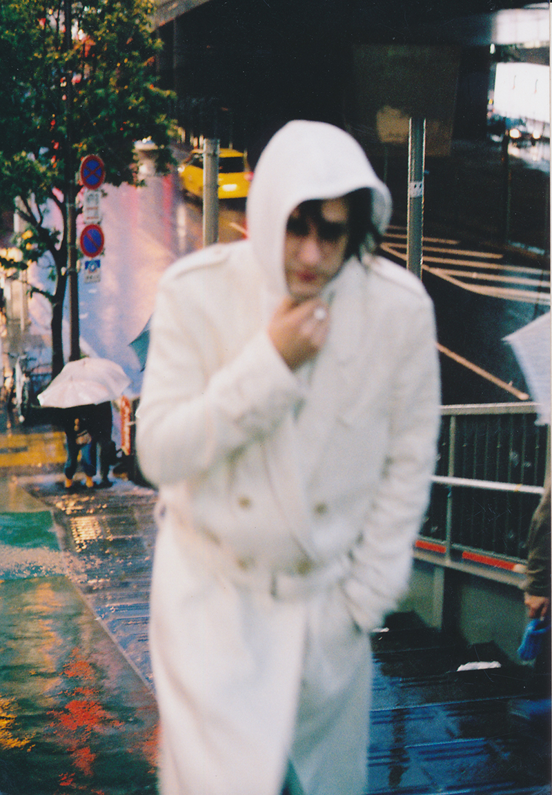
Mr. Murakami saw my photo in BRUTUS magazine series I did and contacted me. I had used a telephoto lens to create a nuance that leads to the rather equivoque section of BRUTUS today. Back then he asked me, “why do you include the guardrail in your photos? All Japanese photographers avoid them, don’t they?” You rarely see guardrails in Europe so by intentionally including it makes the photo look graphical and very “Tokyo” for foreigners. It’s also important for me to express the unique style of Tokyo with what’s already there. On the contrary, it seemed that most photographers during that time were only concerned of how to make their photos look European-like. When a French style building was built in central Tokyo, they all ganged up to shoot there. People abroad wouldn’t feel anything by looking at such photography. But it was mainly Elein’s words that made me realize this. It was right around when I had spent a year abroad Elein asked me, “have you gotten some successful pieces?” I replied, “not even one,” and she said to me, “I’m sure you haven’t. Someone who’s only been here for a year would never be able to capture the true France. I trust you for answering so honestly.” Hearing her made me decide to go back home right away and I feel that it also lead me to my current artistic style.
You often choose Nakano Broadway vicinity as your shooting spot. And Takashi Murakami’s gallery HIDARI ZINGARO is also in Nakano. But I believe you didn’t have the view to photograph “city and people” for a while after you came back to Japan.
Back in those times, we were told to erase all signs in Japanese out of our photos shot around the city. And it wasn’t a time we could touch-up photos easily. So I would shoot a plain white wall behind the construction area thinking how they won’t be able to complain about it. On the other hand, for oversea magazines, I was trying ways to shoot that leads to my current style. During the 80s, Kishin Shinoyama working with Masayoshi Nakajou had a COMME DES GARÇONS shoot inside a traditional Japanese housing which appeared in the HANATSUBAKI spreads. Since then, the trend of using white models came about. That decade or so was a blank period for me. And yet, as I continue to shoot for PURPLE, I began to receive more work, and as I kept on shooting, the cycle standardized. I began photographing in Nakano because of its style being somewhere between Shinjuku and Akihabara was interesting to me. Shinjuku makes me think of Araki too. The sky feels close in Nakano even with the electricity lines above those narrow alley ways. There also are small izakayas and red-light district as well as the otaku folks who come to Nakano Broadway. I found the place to be an extremely Japanese environment.
I believe SHAPES OF BLOOMING would be the photobook compiling your photos of that time. It was published in 2005 by TREESARESOSPECIAL, a production of Mr. Chiba’s, of POETRY OF SEX. I heard that this also took about a year for it to be released.
Back in those times, it was the thing to have an ISBN code on all published books and yet, Mr. Chiba, as you know, had told me, ”we don’t need no such code.” Therefore, I made the book (laughing). It was still my very first book to be published so I got into overthinking about how I want to include this and that ended up neglecting it for a year. Later, I had an idea to create a photobook with the mixture of fashion and portrait which is similar to the method Wolfgang Tillmans used for his i-D magazine shots. The composition makes it seem like a fashion photobook for some people but could be considered simply a portrait collection for others. For example, a snap photo of a model wearing her own clothes could seem like fashion photography in a certain moment. Fashion isn’t always about runway items, you know?
Do you think that also has to do with the fashion value of that era? Say, around that time, Ann-Sofie Back made the models walk in their own clothes on the runway.
You’re absolutely right. It was partially intentional. In this book, there are clothes of ANN-SOFIE BACK as well as BERNADETTE CORPORATION. I also shot Vito Acconci, Sophie Calle, and Thuy Pham in their own outfits. So all things considered, there may be an atmospheric nuance specific to that era flowing throughout the book which was unnoticeable then.
I’m sure you’ve shot many people in different countries so how did you feel about the different lighting of each places?
Whether it's humid or not is extremely important to begin with. That determines if the image becomes crisp or not. And of course, the daylight hours vary from city to city. The lateral sunlight lasts a long time in London. You can see this in the old i-D magazine but they’re creating 3-dimentional images by utilizing that lateral lighting well. On the other hand, the lateral sunlight of Tokyo is short.
Do you think there can be a value to a sense of discomfort such as one created by Japanese intentionally using a parody of European style?
Satoshi Saikusa who was shooting for VOGUE PARIS might fit into that example. He was recognized for his VOGUE ITALIA spread in which he used the aesthetic of something like a Japanese OLIVE magazine. Although it’s a parody of Western style, it was considered intriguing in a roundabout way. What’s important here is the perspective of how to objectively express the Japanese aesthetic. Clothes itself came from Western culture so you need to all in all understand the European standards for them to even look at it.
Ways of injecting the Japanese context knowing those standards would influence your artistic style, I suppose. You’ve always mentioned the importance of how you weave in the real and fake.
I believe the way you interweave them matters the most in creating an art of any genre. Same goes for today’s interview for example. Even though I’m speaking the answers, you are guiding me to say what you want me to say. All truth isn’t interesting but all fake isn’t intriguing either. In terms of fashion, stylist Kitamura’s work has a good grasp on this. The clothes of the hanger rack would look ridiculous before the shoot and yet, Kitamura somehow inputs reality and persuasion while dressing them on the model. So in the end, it stages a tension that can only be created between reality and fantasy.
That perspective of yours is not only for photography but is constant for all genre of art.
I especially have that viewpoint while watching movies. What plots are fake and how realistic ideas are incorporated into it. The more truthful parts there are, the more bizarre the fictitious parts can be with audience still believing it. For example, Christopher Nolan’s Batman series come with quite bizarre stories but one of the point that makes everybody get into it is because the Batman’s weapons look like realistic military weapons. Whether it’s fashion or photography or movie, anything in the region of art gets that point across, the reality in fantasy.
Interview text_ SHINGO ISOYAMA

